import plotly.express as px
df = px.data.tips()
fig = px.histogram(data_frame=df, x="tip", nbins=10, color="smoker")
fig.show()
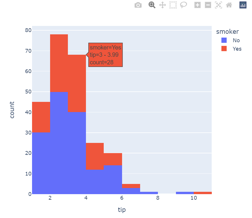
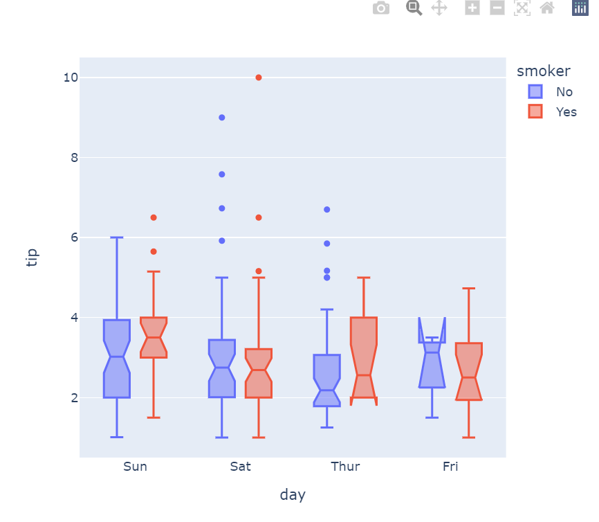
fig = px.box(df, x="day", y="tip", color="smoker", notched=True) fig.show()
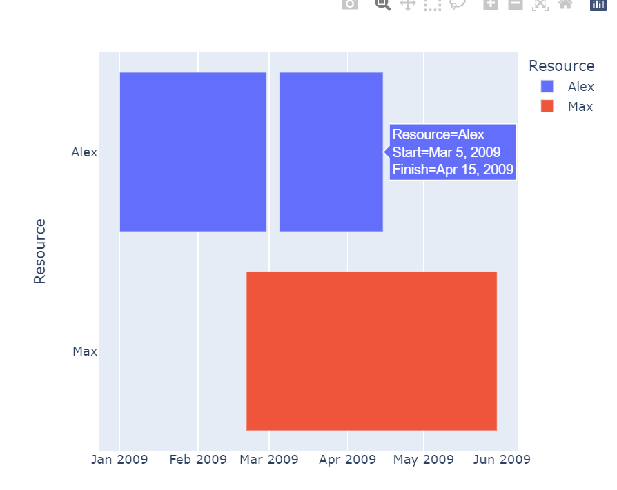
import pandas as pd
df = pd.DataFrame([ dict(Task="Job A", Start='2009-01-01', Finish='2009-02-28', Resource="Alex"),
dict(Task="Job B", Start='2009-03-05', Finish='2009-04-15', Resource="Alex"),
dict(Task="Job C", Start='2009-02-20', Finish='2009-05-30', Resource="Max") ])
fig = px.timeline(df, x_start="Start", x_end="Finish", y="Resource", color="Resource")
fig.show()
data = dict( number=[39, 27.4, 20.6, 11, 2], stage=["Website visit", "Downloads", "Potential customers", "Requested price", "Invoice sent"])
fig = px.funnel(data, x='number', y='stage')
fig.show()

df = px.data.election()
geojson = px.data.election_geojson()
fig = px.choropleth_mapbox(df, geojson=geojson, color="Bergeron",
locations="district",
featureidkey="properties.district",
center={"lat": 45.5517, "lon": -73.7073},
mapbox_style="carto-positron", zoom=9)
fig.show()

반응형
'Data_Analytics' 카테고리의 다른 글
| [Data Analytics] 데이터 분석이란? (0) | 2023.05.02 |
|---|---|
| [Data_Analytics] Seaborn plot (0) | 2023.03.11 |
